John Gurtz > Portfolio > Financial Investment Charting
Financial Investment Charting
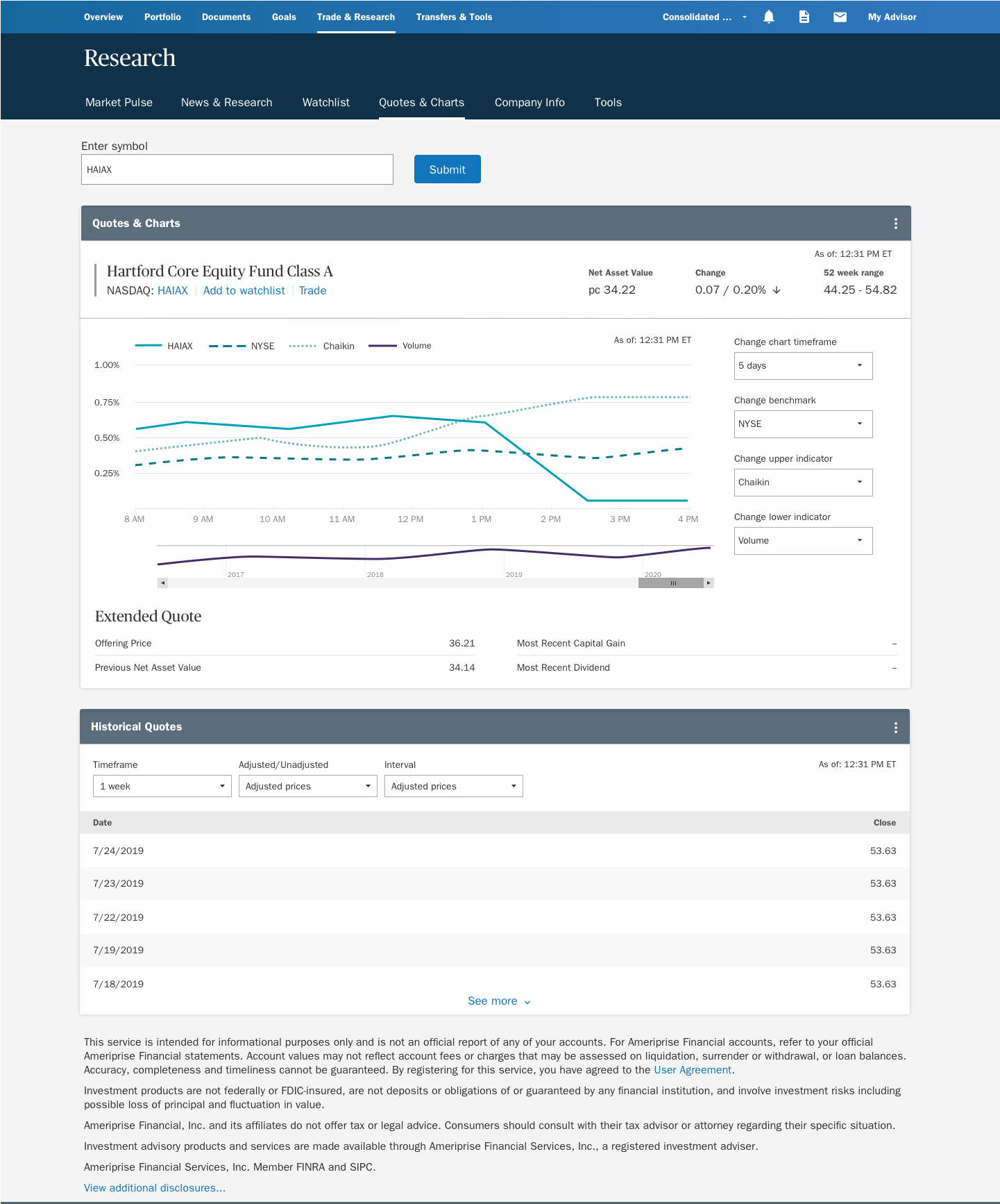
A common feature on financial banking sites is the ability to look up a quote for stocks and mutual funds and see a performance chart. A bank tasked me with redesigning this page with the goal reducing redundancy on the existing pages, increasing engagment, making the charts look better and accessible.
Data Inventory and Design Iteration
I could not just redraw it. I had to understand what was currently in the quotes and chart space. There was widespread duplication of 35 data points spread across 3 pages. With some organization and iteration, I was able to group the data into a single page template. I sketched and mockedup around 20 iterations of the page before the design started to trend in 2 directions.
Competitive Analysis
I also reviewed how other companies presented their quotes and chart pages. I reviewed 8 competitors. I tooks screen shots, analyzied their information architecture, page layout and available data. This informed the page layout.
Testing
A click test was run against two templates in order to determine in which the key data points were easiest to find and read, as well as easiest to find calls to action. The test resulted in a hybrid of the two templates.
Accessibility
A key design objective was the chart had to be visible to users with color blindness. This means charts with multiple lines had to use something besides color to differentiate the lines. Designing the chart to be accessible was easy enough, but our tech had to be able to do it too.
The charts were to be made with an app called HighCharts. I used their public facing code to make a proof of concept of an accessible chart in Codepen.Developers even used my prototype to start their build for production.
